Hello everyone ! Let's talk a bit about the stone witch painting I worked on in January and February.
Before starting, if you don't know my Stone Witches series that's a series of drawing where I create personification of stones and minerals, bringing in scientific and historic fact about the stones to create unique character. This one is the 29th of the series, you can discover all her sisters here : https://elwyn-rain-art.carrd.co/#stone-witches

For this one, I initially wanted to do labradorite, actually to redo labradorite as I've done it in the initial set of Stone Witches, back in 2023. This was and still one of my favorite from the initial set and I quickly identified element I wanted to keep from it : the strong blue, the ray of light, the transparent veil and a mysterious vibe. Well, you may have noticed things haven’t go as planed. Most of the art was about the fact labradorite's colors comes entirely from light diffracting in it and that was a point I wanted to keep.
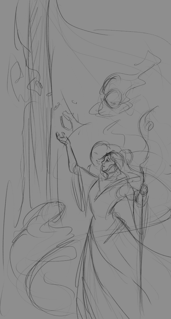
Also in the current series each witch is linked to a theme, in addition to the stone, and for this one it was either mystery or mysticism. I quickly get an idea of a priestess or a mage in some sort of temple, with light falling from the side and big blue curtains. I sketched the idea in my sketchbook, but noticed this might not be a good idea as how I visualized it first was strongly inspired by orientalism.
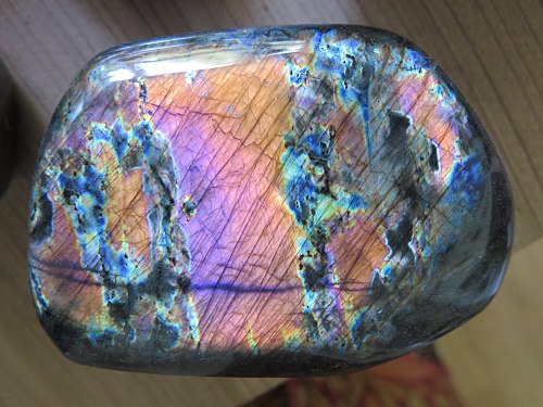
Instead of risking it, I've done more research and found a cool variety of Labradorite, the Spectrolite. Its a variety of labradorite with brighter colours and a wider colour range. Below is a picture from wikipedia :
Then I get the perfect idea: spectre here is in reference to light spectrum, as Spectrolite cover it nearly entirely in its colors, but in French it means ghost too, so I decided to depict a necromancer with some purple ghost around her. I also thought of playing with negative colors but it was cancelled later in the process.
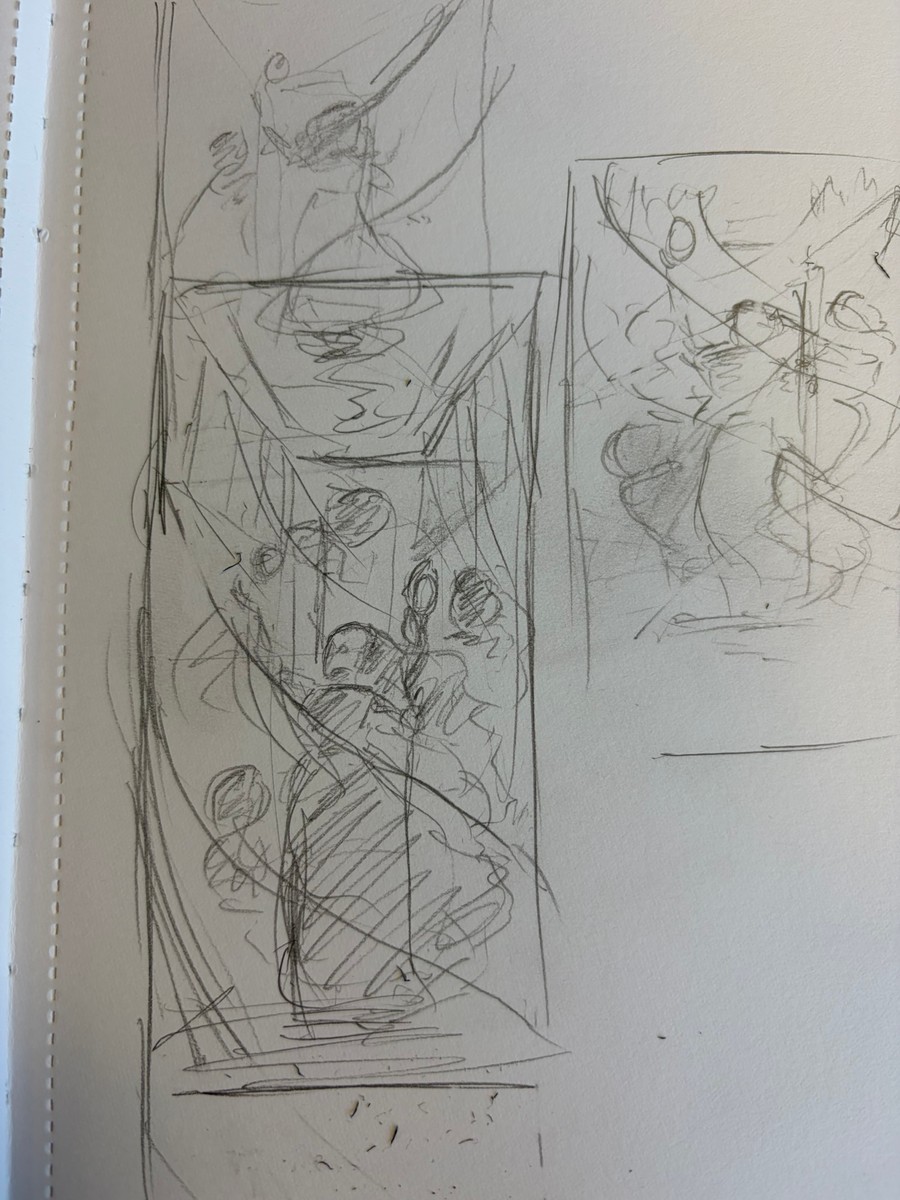
Even by having a quite strong idea of what I was going for and a good first sketch, moving to the lineart wasn't easy and to be fair, I worked on it mostly late, after commission work, and the tiredness hasn't helped. Usually I would have had more time for personal art at more favorable hours but I had commissions I wanted to finish before starting a mentorship (also that's another story). Even harder, I couldn't manage to make the colors work. I ended up with a color with I was quite unhappy with.
For client work I would have probably avoided such a problem by doing more early research and exploration (which I sometime skip on personal work, especially when short in time) and would have push more to find a solution, but as it was some personal work on a busy period I put it on an hold for the time for me to finish my commissions (and to find a way to get trough). Some year ago I would have rendered it anyway but I learnt you better wait and work with a sketch you are really happy with than rushing to clean something that's you don't like and end up with something you are not proud of.
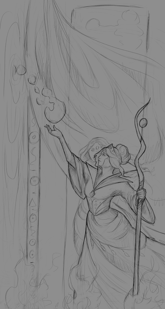
I finally found the solution nearly a month later while I was playing Dragon Age : Inquisition. I was looking at the tarot card in-game art, a style I always loved, and made a small list of what I loved in these so I could applied it in my art. Also I've done a lot of studies early this year and with a small 3d ref (and some more rest) the lineart goes this time smoothly, with a new basis. Some time that what you need, even if the idea is quite similar nearly no lines are the same and the new version is quite stronger.
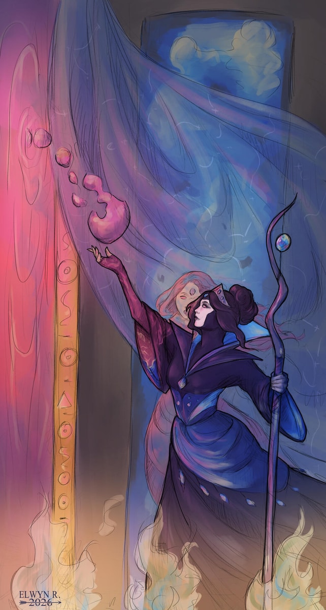
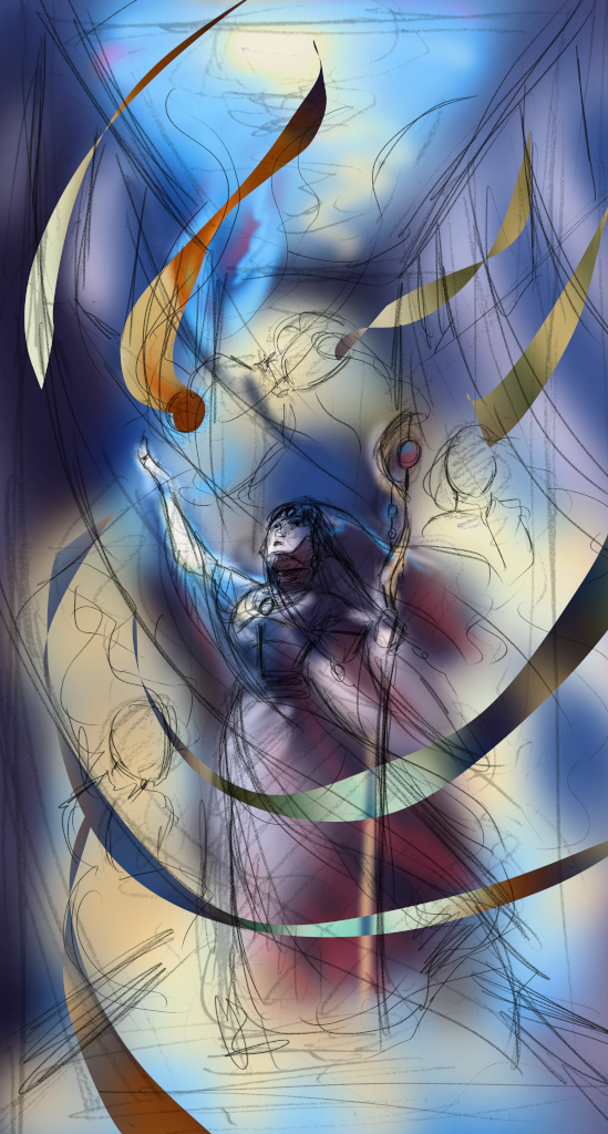
The solution i found was to turn the character for a profile picture with nearly no perspective, reducing the background importance but allowing a stronger and more powerful character. Doing so I lost a bit the light ray idea, but I think it was worth it.
With some more work I smoothly get to a final lineart I loved. I had to reduce the gosth idea too but kept the transparent fabric in the middle and I think in the end the idea of mystery is really here.
From that I worked on the colors. Instead of doing negative colors areas I separated the picture in two area : the labradorite ones mostly in blues, and the spectrolite ones mostly in pink. Adding some soft shadow and light effects and here we are !
Sometime art is easy, sometime its not, but the important is to know how to find the solution and push more to get a result you are happy with.
Hope you love the final !